Spurs - San Antonio’s jersey is perfect. Not too complicated, but at the same time, there is not too much going on. The colors embrace the Mexican culture of southern Texas. The rounded fonts are nice and soft to the eye.

Mavericks - Dallas has beautiful jerseys that show the spirit of the city. Their jerseys show the history of the Cowboys in Dallas. The font and colors are subtle, but they also pop out at you.

Hawks - Atlanta’s tops are nicely designed. The blue sections are great and the name and
number is placed well.

Grizzlies - Memphis found a way to put music into a jersey. The silhouette font with the light on light on dark makes the writing pop out at you just as music does. This is significant because Memphis is known for their music. The colors also go together very well

Bulls - Chicago put elegant, but also strong colors. This is just like a bull; elegant and strong. Other than that, the shadowed font and the sides of the shirt are again, elegant and strong.

Hornets - Charlotte made their uniforms look bold with the thick font and pinstripes. They were inspired by having the first gold rush and mint in their state to add gold details.

Magic - Orlando took their iconic pinstripe uniforms and changed some things in a good way. They kept the pinstripes and put the text and number in the same place. I wish they added more color to make everything pop out. Overall, this is a fantastic uniform.

Cavaliers - I like the uniforms overall. There are some minor details that they could change. One of those is they do not say Cleveland on their jerseys. I am also not a big fan of the sides. Overall, everything else is greatly designed.

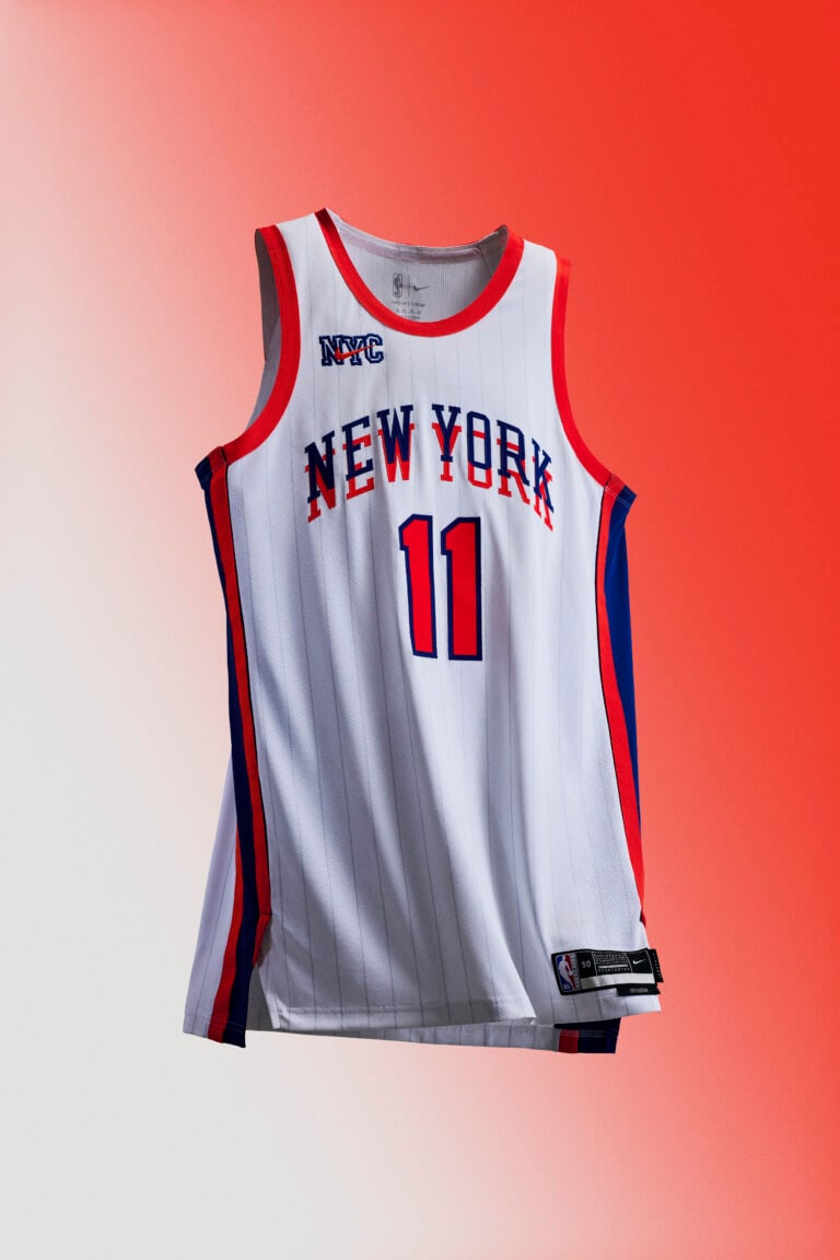
Knicks - Manhattan has great jerseys with the good use of their colors. I like the shadowed letters and the big numbers. The pinstripes are very iconic to the city of New York.

Pistons - Detroit has cool off white uniforms with a nice font for the name. The numbers are placed well. The only thing I would change is to add a design to the side.

Pelicans - New Orleans made good use of these bold neon colors. I would expand the name and number and get rid of the subtle pattern.

Celtics - Boston did a good job turning their iconic jersey design into a neon jersey. I just don’t love the choice of colors in this uniform.

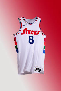
76ers - The Sixers have a completely cool jersey design, their colors just don’t match with their team’s colors. The shirt would be better with red, white, and blue.
Kings - Sacramento’s shirts are cool, they just don’t have any cool factors to them. They are a little too simple for me.

Nuggets - Denver’s uniforms are very cool, I don’t like the color scheme and I also don’t like how there are the 5280 numbers and also the players number. Overall these are okay jerseys

Pacers - Indy’s shirts are nice, the colors are good. In my opinion, I don’t like the printed pattern on the sides. They could have gone with something featuring motor racing instead.

Nets - This uniform simply doesn’t scream “Brooklyn” to me. I don’t like the circular pattern and the red and blue stitches.

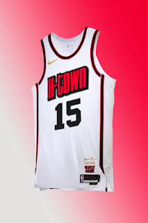
Rockets - These are decent jerseys. Houston didn’t really embrace their city. They should have put rockets in their jersey.
Clippers - This is a bad uniform. It is way too simple. There are pretty much no details.

Bucks - This uniform is too simple and it has a strange white line across it. These jerseys are supposed to be self explanatory. I’m just not sure what this should represent.

Trailblazers - I like the effort, the different components of this jersey, just did not come together. The dotted squares and the “Ripcity” don’t go together.

Warriors - The concept is nice, I like the circular design because it is unique. The colors just don’t fit the theme of the Warriors.

Suns - This jersey has a bit too much going on. Other than that, the jerseys with the city's nicknames are not the best.

Thunder - This is just a copy of the Warrior’s jersey but in a worse fashion. It looks like a normal jersey.

Jazz - Utah has nice shirts, I’m just not loving the complex mountain design. This would have been better with a Jazz reference to it.

Raptors - Toronto didn’t even try. All they did was copy and pasted their old jerseys. They didn’t put in much effort.

Wizards - These are designed nicely, it just didn’t work out. The complex wording with the different fonts and designs don’t lock as they were planned. If these were simpler, they would look way cooler and be higher on my list.

Lakers - These are not very cool. The font is bad and the numbers are too small. Maybe they should have incorporated the old sky blue color because it was in their old uniforms.

Heat - These are very bad. Heat Culture does not make sense and the numbers are too small.

Timberwolves - These uniforms are an epic fail. First, the printed design is horrendous. I’m not sure what this is supposed to be. Also, they have the huge white area in the majority of this uniform. These are an utter mess.


Comments
Post a Comment